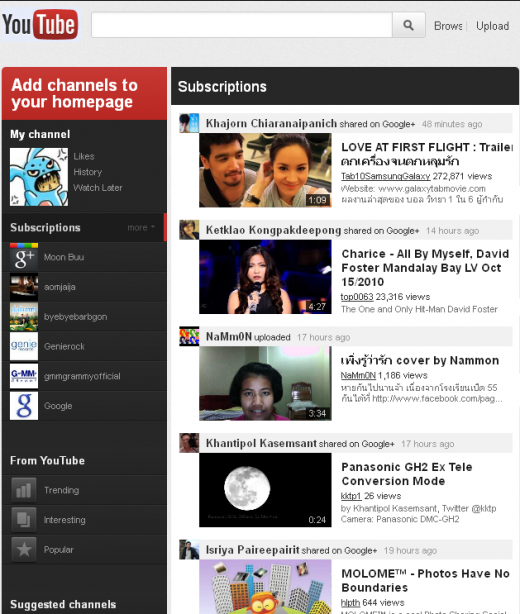
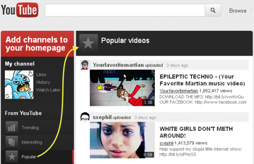
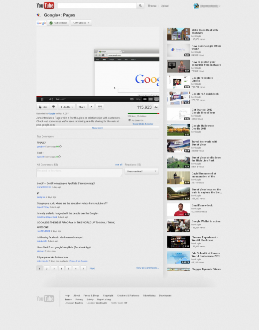
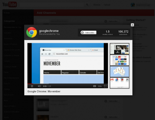
YouTube telah melancarkan ujian untuk menghasilkan user interface yang berwajah baru. Walaubagaimanapun, perubahan ini masih diperingkat permulaan dan belun lagi dibuat secara rasmi. Jom kita tengok screenshot dan perubahan dalam interface baru ni.
YouTube Redesign Highlights:
- Deeper Google+ integration shows off YouTube content your Circles have shared to Google+, letting you surf user-recommended videos from people you might actually care about.
- New left-column dashboard sorts your Subscriptions and more into easily-clickable sections, including featured videos and recommended content categories.
- Homepage content will be displayed in a single column, putting a focus on larger preview images for videos.
- A slight color scheme tweak (new gray background) highlights content.
- The “fullscreen” button in actual YouTube videos will receive a more user-friendly update, giving viewers the option to shrink, expand or, yes, fullscreen the video.
- Recommended video content pops out when clicked, allowing you to easily exit to where you last were before clicking after viewing.
- Clicking the YouTube logo on the top left of the site will lead to http://www.youtube.com/guide.
- YouTube’s favicon will also be switched out for an updated version.


2 comments:
aku penah experience satu mlm tuh, utube test skrin..cambest je..hehehe
oh damn ! Google Chrome + Youtube + Switch Off Light Add On . oh yeah !
Post a Comment